Got something to say or just want fewer pesky ads? Join us... 😊

The round club badge back>


Jan 19, 2009
3,151
Worthing
YES I DO!

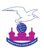
My tea mug has 14 of the old crests on it, I have had customers wanting to pay me good money for it.

I gave a mug to my boy with the 2 crests of Brighton and Hove, probably from the sixties. Maybe you could enlighten me?

Personally, I like the 'new' one.


Martinf

SeenTheBlue&WhiteLight
Mar 13, 2008
2,774
Lewes
Bring the round one back - and just blue and white! Get rid of the red -sorry comrades.


Goldstone Rapper

Rediffusion PlayerofYear
Jan 19, 2009
14,865
BN3 7DE
Well, here's a new BHAFC badge.... :jester:
 

Attachments

  • s-eeeagulls2.jpg
    s-eeeagulls2.jpg
    25.9 KB · Views: 303


ROSM

Well-known member
Dec 26, 2005
6,580
Just far enough away from LDC
Well, here's a new BHAFC badge.... :jester:

In the early 90s, Barry Lloyd looked to amend the badge to turn the seagull around as it looked like it was in his opinion 'flying backwards'. It was pointed out that in fact in heraldic terms it was facing battle the way it was and is a bad omen to reverse it.


GNF on Tour

Registered Twunt
Jul 7, 2003
1,365
Auckland


Jamie

New member
Jun 28, 2008
882
sorry if this is too late, but er, I cant work out how create a poll. I expect I am being very dim, but if anyone knows how to do it and they want one then er can they crate the poll


Oct 11, 2005
248
London
Hi,

I'm a STH in E Block, and a supporter since I was small. I'm also a graphic designer and run a brand design firm. I've wanted to redesign our badge or at the very least bring back the old roundel since Dick Knight changed the design in 1997.

I recently did some work looking into the potential re-brand of the Albion. I approached the club in August with my designs and received a minimal response. They said that the stadium's architects were going to redesign the badge (which is a bit like asking the dentist to mend your broken leg)..

I've developed two routes; the first is about reviving the 1970's roundel, giving the seagull a bit of personality and adding the Sussex marlets to the collar. The second route is inspired by our club's 1950's badge and positions the Albion ready for a fresh new start at Falmer.

I'd be really interested to hear what people think…

Cheers, Matt
 

Attachments

  • Roundel_1.jpg
    Roundel_1.jpg
    73.8 KB · Views: 243
  • Logo_zoom_2.jpg
    Logo_zoom_2.jpg
    65.6 KB · Views: 243


Stoo82

GEEZUS!
Jul 8, 2008
7,530
Hove
This was my effort from a while back, knocked up in about 10 minutes during my lunch break. It keeps the roundel, but changes the seagull which, while still 'soaring' looks as though it's about to take a dump on whatever poor bastard is below it - a suitable metaphor methinks.

View attachment 9304

Anyhoo, please bear in mind it was done in 10 minutes...

I like that. Its modern and you get the feeling both the old and the new badge have been merged.:clap:


Jamie

New member
Jun 28, 2008
882
Th original round effort or TLO's for me..TLO's looks class, tho would like the seagull entirely withing the circle


Stoo82

GEEZUS!
Jul 8, 2008
7,530
Hove
I'd be really interested to hear what people think…

Cheers, Matt

I dont like the last one at all. Sorry. The first one is ok although the seagull looks evil and ti dont like the three birds on either side. I like the gold ring around the badge.

Sorry if thats a tade harsh, much better than anything i could ever do though.


D

Deleted member 2719

Guest
Hi,

I'm a STH in E Block, and a supporter since I was small. I'm also a graphic designer and run a brand design firm. I've wanted to redesign our badge or at the very least bring back the old roundel since Dick Knight changed the design in 1997.

I recently did some work looking into the potential re-brand of the Albion. I approached the club in August with my designs and received a minimal response. They said that the stadium's architects were going to redesign the badge (which is a bit like asking the dentist to mend your broken leg)..

I've developed two routes; the first is about reviving the 1970's roundel, giving the seagull a bit of personality and adding the Sussex marlets to the collar. The second route is inspired by our club's 1950's badge and positions the Albion ready for a fresh new start at Falmer.

I'd be really interested to hear what people think…

Cheers, Matt

I like the first one , not sure about the second, probably cos i wasn't around in the 1950's!


£1.99

Well-known member
Mar 3, 2008
1,225
Hi,

I'm a STH in E Block, and a supporter since I was small. I'm also a graphic designer and run a brand design firm. I've wanted to redesign our badge or at the very least bring back the old roundel since Dick Knight changed the design in 1997.

I recently did some work looking into the potential re-brand of the Albion. I approached the club in August with my designs and received a minimal response. They said that the stadium's architects were going to redesign the badge (which is a bit like asking the dentist to mend your broken leg)..

I've developed two routes; the first is about reviving the 1970's roundel, giving the seagull a bit of personality and adding the Sussex marlets to the collar. The second route is inspired by our club's 1950's badge and positions the Albion ready for a fresh new start at Falmer.

I'd be really interested to hear what people think…

Cheers, Matt

Matt
First one 10 out of 10 looks modern with added retro I can see it still looking good for many years

Second 9 out of 10 again good looker just think it might not date as well as the first.


The Large One

Who's Next?
Jul 7, 2003
52,343
97.2FM
Hi,

I'm a STH in E Block, and a supporter since I was small. I'm also a graphic designer and run a brand design firm. I've wanted to redesign our badge or at the very least bring back the old roundel since Dick Knight changed the design in 1997.

I recently did some work looking into the potential re-brand of the Albion. I approached the club in August with my designs and received a minimal response. They said that the stadium's architects were going to redesign the badge (which is a bit like asking the dentist to mend your broken leg)..

I've developed two routes; the first is about reviving the 1970's roundel, giving the seagull a bit of personality and adding the Sussex marlets to the collar. The second route is inspired by our club's 1950's badge and positions the Albion ready for a fresh new start at Falmer.

I'd be really interested to hear what people think…

Cheers, Matt

As someone who has also been involved in branding (though sadly not in my current job), I would like to offer an honest critique.

The roundel has elements which are simple, classy and easily recognisable, and I like a lot. The typography is excellent. The martlets are a good idea, but I feel have been placed in the most convenient place, rather than as an intrinsic part of the design. The six martlets ought to be together. It could be, for instance, that there may be a place for them under the roundel, though I would need to see it in order to know whether that would work - I suspect not. The seagull itself is intriguing but, perversely, has a bit too much 'character', as opposed to being more classicly heraldic (something I feel more appropriate for a badge).

The second design, while appreciating the inspiration is, I feel, overworked. There are too many elements on which I feel it doesn't work. Sorry.


Oct 11, 2005
248
London
Thanks for the feedback, its always interesting to hear what people think about your work.. good and bad.

Stoo82, your comment that the seagull looks evil is interesting. I had drawn it to look like that after talking to other fans - it was generally felt that the current 'pregnant' seagull looks like a pushover, while a tougher, more streetwise seagull would be better.

TLO, I tried the 6 martlets in many different places but it was becoming too 'birdy' so placing them in the collar as a natural break between the club name worked best.

Albion, I owe you a pint.

Here's route 2 without the background glitz.. NB. the top of the shield is designed to resemble waves.
 

Attachments

  • Route_2.png
    Route_2.png
    46.1 KB · Views: 218


Barrel of Fun

Abort, retry, fail
In the early 90s, Barry Lloyd looked to amend the badge to turn the seagull around as it looked like it was in his opinion 'flying backwards'. It was pointed out that in fact in heraldic terms it was facing battle the way it was and is a bad omen to reverse it.

Christ. We were relegated soon after and plummeted to the bottom tier. We lost our ground, ended up groundsharing in Kent and have been homeless/hopeless (delete as applicable) for almost 13 years. Imagine what would have happened if he had got it reversed?


Ian Bairds Fist

Active member
Nov 26, 2003
867
Kingston-upon-Thames
Hi,

I'm a STH in E Block, and a supporter since I was small. I'm also a graphic designer and run a brand design firm. I've wanted to redesign our badge or at the very least bring back the old roundel since Dick Knight changed the design in 1997.

I recently did some work looking into the potential re-brand of the Albion. I approached the club in August with my designs and received a minimal response. They said that the stadium's architects were going to redesign the badge (which is a bit like asking the dentist to mend your broken leg)..

I've developed two routes; the first is about reviving the 1970's roundel, giving the seagull a bit of personality and adding the Sussex marlets to the collar. The second route is inspired by our club's 1950's badge and positions the Albion ready for a fresh new start at Falmer.

I'd be really interested to hear what people think…

Cheers, Matt

They are both excellent, but I prefer the first one. The angry seagulls, incorporation of the martlets and round crest are all winners. I hope someone from the Club is reading this because our current badge is awful.

Maybe this thread can be passed to Insider and onto the Club to see what they think. Maybe run a poll to see which design we should move forward with.

We're a democratic Club after all, arent we?!


Albion and Premier League latest from Sky Sports


Top
Link Here