Got something to say or just want fewer pesky ads? Join us... 😊

The Albion's new badge?

Which route do you prefer?

  • Route a

    Votes: 33 24.3%
  • Route b

    Votes: 92 67.6%
  • Route c

    Votes: 11 8.1%

  • Total voters
    136


Oct 11, 2005
248
London
Hi, following some very positive feedback to the designs I have developed for a new club badge...

The round club badge back - Page 5 - North Stand Chat

...I thought it would be interesting to carry out a poll and see which is the more popular design;

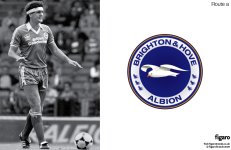
Route a: is a revival of the 1970's roundel, giving the seagull a bit of personality and adding the six Sussex marlets to the collar.

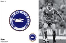
Route b: based on nsc feedback I have removed the martlets from the roundel and reverted to the original layout of B&HA.

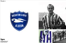
Route c: is inspired by our 1950's badge and positions the Albion ready for a fresh new start at Falmer. The top of the shield has been designed to resemble waves.

It would be great to hear what people think…

Thanks, Matt
 

Attachments

  • Route_a.jpg
    Route_a.jpg
    296.8 KB · Views: 989
  • Route_b.jpg
    Route_b.jpg
    314.3 KB · Views: 1,015
  • Route_c.jpg
    Route_c.jpg
    235.7 KB · Views: 980


Stoo82

GEEZUS!
Jul 8, 2008
7,530
Hove
Vote for A dispite my previous objections. EVen thought I was born and bread in susses I had little idea about the martlets. But I would like to see us as a Sussex club as well as a Brighton and Hove Club.

Top work.


Napper

Well-known member
Jul 9, 2003
24,456
Sussex
B but needs The Seagulls on the lower part of the circle

Is anyone actually going to put this to the club ?


The Wizard

Well-known member
Jul 2, 2009
18,401
There all too 'american football' to me, I'd like our current seagull on the round badge.


Oct 11, 2005
248
London
Thanks for the support.. I approached the club with my work in August but they told me the stadium's architects are going to redesign our badge.. which is a bit like asking a dentist to mend your broken leg. It's also pretty sad as I thought we were supposed to be a community club that listens to it's fans.

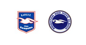
On the points about the seagull.. I redrew the seagull after talking to other supporters - it was generally felt that the current 'pregnant' seagull looks like a pushover, while a tougher, more streetwise seagull would be better...
 

Attachments

  • Old_v_new.jpg
    Old_v_new.jpg
    179.8 KB · Views: 944


Bry Nylon

Test your smoke alarm
Helpful Moderator
Jul 21, 2003
20,577
Playing snooker
For my money, if it ain't broke, don't fix it.
Loved the old round badge and would happily go back to that it a heartbeat. No re-design needed.
 

Attachments

  • eng-brighton_and_hove_albion_fc.gif
    eng-brighton_and_hove_albion_fc.gif
    3.7 KB · Views: 965


Napper

Well-known member
Jul 9, 2003
24,456
Sussex
The blue on the round badge is superb, as mentioned if you could get the segulls on the lower part of the circle it would be complete.
Would love to have that !


Silent Bob

( ͡° ͜ʖ ͡°)
Dec 6, 2004
22,172
I'm not too keen on the seagull, I don't like the way the wings look - maybe that's just the program you're using or something. Plus while I do think the seagull could do with a bit of a freshen up I generally think it should have as little detail on it as possible, it should be a simple icon not a drawing or cartoon.
My favourite crest is B, the martlets are a nice idea but again I think it should be kept simple and they clutter it up a little, and I prefer the BHA all together. The colours and font are great.


Martinf

SeenTheBlue&WhiteLight
Mar 13, 2008
2,774
Lewes
Thanks for the support.. I approached the club with my work in August but they told me the stadium's architects are going to redesign our badge.. which is a bit like asking a dentist to mend your broken leg. It's also pretty sad as I thought we were supposed to be a community club that listens to it's fans.

On the points about the seagull.. I redrew the seagull after talking to other supporters - it was generally felt that the current 'pregnant' seagull looks like a pushover, while a tougher, more streetwise seagull would be better...

If they had listened to the fans a few more times then perhaps we wouldn't have the awful crest in the first place, the crap pink kit that we lost the play-offs to Notts County at Wembley and that ridiculous kit with stripey shorts that they wore that made them look like deck chairs.

Home kit: blue and white shirts, white shorts with BADGE B, away kit either white or yellow, no red whould be incoporated! :rant:


Ian Bairds Fist

Active member
Nov 26, 2003
867
Kingston-upon-Thames
Design B for me.

This is what football messageboards should be about - working together to improve your Club. What a great story it would be for a supporter of the Club to be responsible for the design of the new badge.
Considering all the hard work the supporters of this Club have put in over the last ten years from marching to the Goldstone, changing the dynamic of the Club through the sheer determination and bloody-mindedness and campaigning for our new home, it would be fitting for a guy like Mayfair Seagull to design our new identity.

With Falmer on the horizon we need to have a strong image and identity. This Club is going somewhere and it needs a design representing that fact.

The Club badge is of massive importance - and if what Mayfair Seagull says about the rebranding coming from the architects then I fear for the worst. This can't happen without a consultation with the fans.

I believe we loyal, die-hard supporters should be consulted on OUR new identity.

Is anyone from the Club listening?


Albion and Premier League latest from Sky Sports


Top
Link Here