Got something to say or just want fewer pesky ads? Join us... 😊

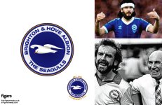
The Albion's new badge?

Which route do you prefer?

  • Route a

    Votes: 33 24.3%
  • Route b

    Votes: 92 67.6%
  • Route c

    Votes: 11 8.1%

  • Total voters
    136


auschr

New member
Apr 19, 2009
1,357
USA
The state of new badges for the most part are worrying, so many of them look so boring and uninspired, like something some guy with an illegal copy of photoshop stumbled upon some football manager forum with a few templates of badges and just filled it with some pictures.

These for example are just awful and uninspired:

Notts_county_crest.png


swindon_town_fc_2007_badge.PNG


readingfc.gif


I would love it if the club asked for people to come forward with designs and have people vote. I love B + C and I wouldn't mind going back to the old badge we had before.


GNF on Tour

Registered Twunt
Jul 7, 2003
1,365
Auckland
For my money, if it ain't broke, don't fix it.
Loved the old round badge and would happily go back to that it a heartbeat. No re-design needed.

That gets my vote as well, that badge was a classic and would still look fine today.


Couldn't Be Hyypia

We've come a long long way together
NSC Patron
Nov 12, 2006
16,730
Near Dorchester, Dorset
http://twitter.com/figarobrands

I respect you for having a go and I agree there is a lot wrong with the current logo, but nope of the options you put forward are very good I am afraid. Warmed over versions of the old logos but confused and incoherent. The seagull is too complex and won't work in mono executions - so it won't reproduce well where the colour cannot be applied.

I applaud the debate but I vote "(d) None of the above."


Silverhatch

Well-known member
Feb 23, 2009
4,695
Preston Park
According to Wiki (so it must be true) and going all Merlin, we (BHA) lay rightful claim to the title "Albion".

If that's the case then it feels right that we should have a round shield to bludgeon the opposition in close quarter combat.

Whatever goes in the middle (and I like b and the classic cup final badge) - it has to be round.


Brovion

In my defence, I was left unsupervised.
NSC Patron
Jul 6, 2003
19,871
For my money, if it ain't broke, don't fix it.
Loved the old round badge and would happily go back to that it a heartbeat. No re-design needed.
I think there's quite a few of us who agree with you. However out of Mayfair's designs I prefer B which is the nearest to the classic original.

However all 3 are WAY better than what we have currently.


BRIGHT ON Q

Well-known member
Jul 5, 2003
9,248
I dont like the curly wing


Oct 11, 2005
248
London
http://twitter.com/figarobrands

I respect you for having a go and I agree there is a lot wrong with the current logo, but nope of the options you put forward are very good I am afraid. Warmed over versions of the old logos but confused and incoherent. The seagull is too complex and won't work in mono executions - so it won't reproduce well where the colour cannot be applied.

I applaud the debate but I vote "(d) None of the above."

Thanks for your comments. Times have moved on and the days when having one logo to be used as mono/cmyk/rgb versions have gone. These days brands can afford the luxury of several different versions of their brand identity, tailored for the constraints of a particular application. For example, a mono version of any of my 3 routes would contain a less detailed seagull. Therefore your concerns are a little, last century.

Moving forward, the role of the seagull is potentially far greater than to just appear in the centre of our badge.. I believe it should be brought to life for online and stadium animations.. but that's probably for another day.

Thanks also for the free publicity with the link to my company's twitter page. Not sure what you're trying to say by posting that, but when I approached the club in August I made it very clear to them that as a fan of some 22yrs, I would be more than willing to not charge any fees for my work.


Oct 11, 2005
248
London
Many thanks for all the feedback...as requested, here's route B with 'The Seagulls' written along the bottom. Personally I'm not sure about this as it feels a bit repetitive having the seagull illustration and then 'The Seagulls' as well... but see what you think.
 

Attachments

  • Route_b_2.jpg
    Route_b_2.jpg
    330.6 KB · Views: 208


strings

Moving further North...
Feb 19, 2006
9,969
Barnsley
http://twitter.com/figarobrands

I respect you for having a go and I agree there is a lot wrong with the current logo, but nope of the options you put forward are very good I am afraid. Warmed over versions of the old logos but confused and incoherent. The seagull is too complex and won't work in mono executions - so it won't reproduce well where the colour cannot be applied.

I applaud the debate but I vote "(d) None of the above."

Me too.

I'm still not convinced of any of the designs. I agree with the sentiment that a new badge would be a good way of welcoming in a new era, and I applaud your efforts.


matt

Well-known member
Mar 19, 2007
1,564
A lightly updated version of the classic blue circle with white seagull for me.

BTW that doesn't look like a seagull to me, it looks more like an albino budgie...


Braders

Abi Fletchers Gimpboy
Jul 15, 2003
29,224
Brighton, United Kingdom
the original B for me , like it alot :)


countrygull

Active member
Jul 22, 2003
1,114
Horsham
B with the Seagulls underneath. I do like the idea of the Martletts too however: proud to be Sussex. Maybe we could have a squadron of Seagulls with martletts as wing men swooping over a vision of Falmer..........:)


Oct 11, 2005
248
London
Thanks for the feedback. As a fair few people are still really keen on the original 1970's badge I'll design a lightly freshened up version of this and post it on here later..


house your seagull

Train à Grande Vitesse
Jul 7, 2004
2,693
Manchester
but nope of the options you put forward are very good I am afraid.

i love NSC, i really do, but comments like that make my blood boil.

sir, please add some context to your cutting, unfounded critique - with arrogance like that i can only hope that you are a creative director at a respected marketing or communications firm?


ROSM

Well-known member
Dec 26, 2005
6,776
Just far enough away from LDC
i love NSC, i really do, but comments like that make my blood boil.

sir, please add some context to your cutting, unfounded critique - with arrogance like that i can only hope that you are a creative director at a respected marketing or communications firm?


you quoted him out of context - he did give reasons. You may not like/agree with his reasons but he did give them.

As for me, would say they are a curates egg. I can see elements I like (the roundel, text, use of martlets) but I'm not so keen on the seagull design. If you look at liverpool, they've kept the liverbird pretty much the same. They've not given it attitude or an angry snarl.

But I have no professional qualifications in this so will simply rely on the defence that I may not know much about art, but I know what I like.


Albion and Premier League latest from Sky Sports


Top
Link Here