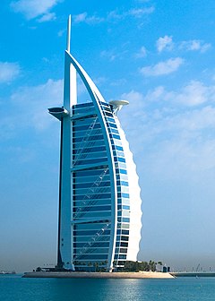
That artists impression makes it look like a cheap tacky carbuncle of a building. I'd have turned it down as well, it looks shit.
Have another go and try and be a bit more stylish next time.
I've finally seen some pictures of it and I have to say it does look a bit crap. I'd suggest having another go with something a bit more imaginative.


