When the club re launches itself at Falmer does anyone else want the round blue badge with a white seagull in the middle back. The one used at the cup final. For me that was the Albion's best badge as it was unique in shape and well I thought pretty cool. The crest badge is like every other crest in the league
You are using an out of date browser. It may not display this or other websites correctly.
You should upgrade or use an alternative browser.
You should upgrade or use an alternative browser.
The round club badge back>
- Thread starter Jamie
- Start date
More options
Who Replied?I thought that there was a rebranding exercise in the offing?
(this information, I seem to remember, came from NSC and so may not actually be true)
From a personal point of view I prefer the shield crest, but thats is because it is the crest I have grown up with. I perfectly understand why other fans would want the older round crest, however as a fan in his early 20s the only association with the round crest I can make is from the Archer/Bellotti era.
Last edited:
When the club re launches itself at Falmer does anyone else want the round blue badge with a white seagull in the middle back. The one used at the cup final. For me that was the Albion's best badge as it was unique in shape and well I thought pretty cool. The crest badge is like every other crest in the league
YES I DO!
My tea mug has 14 of the old crests on it, I have had customers wanting to pay me good money for it.
Arthur
Well-known member
On the subject of badges how many changes have we had over the years? Anyone got an images of the older ones??
Lokki 7
WSU
I think we should adopt something new and relevant that encapsulates everything it means to be a Brighton fan. The despair, the struggle, the passion. How about a pink striped man bag with a diamante seagull motif on the front of it?
I think we should adopt something new and relevant that encapsulates everything it means to be a Brighton fan. The despair, the struggle, the passion. How about a pink striped man bag with a diamante seagull motif on the front of it?
Under an umbrella?
burrish-gull
Active member
- Mar 24, 2009
- 813
When the club re launches itself at Falmer does anyone else want the round blue badge with a white seagull in the middle back. The one used at the cup final. For me that was the Albion's best badge as it was unique in shape and well I thought pretty cool. The crest badge is like every other crest in the league
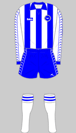
Yes please, along with an update on the old 'Bukta' 78/79 promotion kit. If they walk out at Falmer for the first game with that on then I'll feel all the years of pain will of been worth it.

Last edited:
clapham_gull
Legacy Fan
- Aug 20, 2003
- 25,721
There was nothing wrong with the old one. Bring it back.
- Thread starter
- #12
Yes please, along with an update on the old 'Bukta' 78/79 promotion kit. If they walk out at Falmer for the first game with that on then I'll feel all the years of pain will of been worth it.
I'm with you, with white sleeves and the Bukta logo down the aarms that looked like seagulls. Same down the side of the shorts. The yellow away kit with the blue seagulls/bukta logo down the arms was cool as well.
Was not Was
Loitering with intent
- Jul 31, 2003
- 1,598
Under an umbrella?
... ella ...
The Large One
Who's Next?
On the subject of badges how many changes have we had over the years? Anyone got an images of the older ones??
Not that many - about four or five.
We've had the seagull in a shield since 1999. Before that, it was the seagull in a circle - or variations therein - from 1977 to 1999. We've also had the twin crests of Brighton and Hove, as per the cententary shirt - that was used in the late 50s and through the 60s.
There was also the black shield with white script 'BHA FC' in the 1940s-50, and the monogrammed 'BHAFC' in the 70s.
There was a dolphin design done, but I can't find any reference to it actually being on a shirt. Apart from that, as far as I am aware, we've had a badge-free shirt.
Tim Carder's book has plenty of images of the shirts with their different badges.
Last edited:
burrish-gull
Active member
- Mar 24, 2009
- 813
The Large One
Who's Next?
Myself, I'd be happy to see the round badge back - not that there is anything wrong with the shield, and I could understand the reasoning behind the change.
I have done one or two designs off my own bat, and attracted much scorn for it - especially as the current seagull design, which I do think is now sorely dated, was changed.
Personally, I would like to incorporate the elements of the seagull, the county martlets of Sussex, the stripes, and the club name and nickname into a new round badge. All very do-able.
Dick Knights Mumm
Take me Home Falmer Road
I personally LOVE the Brighton and Hove crests on the centenery Kit, thought they were tops and if we are going to change badges id opt for them instantly.
I agree with the gentleman. That badge looked superb.