Winker
CUM ON FEEL THE NOIZE
Will all the shorts have that tail attached? Coxy might take off in a strong wind.
This is what it should have looked like;
Do they do it in any smaller sizes?
This is what it should have looked like;
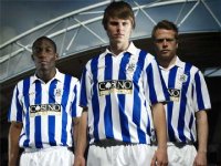
That Huddersfield one or whatever it is above looks better. I think the club have just run out of ideas. Someone needs to sit down and explain to them how much money they are losing through poor kit design (or resuscitate whoever designed the first Skint kits we had). Having the logos in the middle makes it look like proper amateur, although it doesn't help that the sponsor logo looks like it was designed in Word.
But then who gives a shit as long as we win in it!!


This takes me back to August 1999. Scars and Stripes included in our editorial for the Mansfield game a comment about the quality of the new home kit (we weren't too complimentary).
After the match Bozza and I had the (dis)pleasure of have a seemingly drunk Nick Rowe shouting at us outside the Prince Regent pub in Trafalgar Street, telling us that we (the fanzine) had no right to criticise the kit. He seemed quite upset
Dick was there as well, and seemed quite perplexed by Nick's reaction.
He was a nice man, the Nick Rowe
Papa
That must have been after he'd been at The Evening Star with Micky and Corky during their city 'victory walkabout'. Micky and Corky were good company but agree with you about Nick Rowe.
That Huddersfield one or whatever it is above looks better. I think the club have just run out of ideas. Someone needs to sit down and explain to them how much money they are losing through poor kit design (or resuscitate whoever designed the first Skint kits we had). Having the logos in the middle makes it look like proper amateur, although it doesn't help that the sponsor logo looks like it was designed in Word.
Totally agree with you about the club running out of ideas. They should go back to stripes all round in the way Sunderland and others have done. That white back looks shit. Sorry Mr Knight, you've got my money for a season ticket but my shirt money is staying in my wallet.