Got something to say or just want fewer pesky ads? Join us... 😊

(we did have) Confirmation of the new badge


Giraffe

VERY part time moderator
Helpful Moderator
NSC Patron
Aug 8, 2005
27,349
Can't find it but found this:

Details for application number: BH2010/03838
Guide to measuring/scaling from plans
address:American Express Community Stadium Village Way Falmer Brighton
description:Display of internally-illuminated totem sign, halo-illuminated fascia signs and internally-illuminated fascia signs with exterior LED halo lighting to facade of stadium. Display of non-illuminated totem, banner and post-mounted signs of varying sizes to stadium approach and concourse, including double-sided totem sign with LED screen.
application type:advertisement
development type: advertisement
received date:10/12/10
valid date: 21/01/11
registered date:24/01/11
target decision date:18/03/11
ward: Moulsecoombe And Bevendean
status:UNDER CONSIDERATION
applicant: Brighton & Hove Albion Football Club Ltd
Tower Point
8th Floor
North West Suite
44 North Road
Brighton
BN1 1YR
agent: DMH Stallard
100 Queens Road
Brighton
BN1 3YB


Giraffe

VERY part time moderator
Helpful Moderator
NSC Patron
Aug 8, 2005
27,349
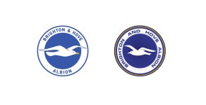
I have put the Seagull back to where it was on the original badge. Now we can compare the two. I prefer the seagulls nose pointing to the left. It feels right that way

View attachment 21270

Definitely looks better facing towards the left. That's my only complaint though. Otherwise it's growing on me


Lady Bracknell

Handbag at Dawn
Jul 5, 2003
4,514
The Metropolis
Here it is:
amex.jpg


clapham_gull

Legacy Fan
Aug 20, 2003
25,968

Yep, been on the official website/argus for a while as well - sneaking it back of photographs of the stadium.

I assumed it had already been mentioned. Again, I'm not really that impressed.

When your other half mentioned it a while back, I assumed the above was a temporary thing and was waiting for the "real one" to appear.

To be honest, I don't really care about that. I just very disappointed with the new badge,
 
Last edited:


D'Angelo Saxon

SW19ULLS
Jul 30, 2004
3,097
SW19
I like the Amex logo. I'm still clinging on to hope that THAT logo is just a quickly knocked up one for planning applications...


algie

The moaning of life
Jan 8, 2006
14,713
In rehab
Can someone put this new badge side by side with Mayfair's version to compare?


ROSM

Well-known member
Dec 26, 2005
6,851
Just far enough away from LDC
Loved the club spin on this;

Extensive consultation.......that would be the one evening of tea and biscuits that was mentioned on NSC

Progressively flying forward ......... That would mean reversed to make it look different from previous logos


As I've said before, in heraldic terms animals should face to the left. This is driven by images being on shields which were worn on the left arm whilst swords were on the right. This way the image would be facing toward battle. By those rules we now have an image that is fleeing battle.

At least arsenal were up front when they reversed their cannon by explaining it was about brand protection.


Oscar

Well-known member
Nov 10, 2003
3,864
Loved the club spin on this;

Extensive consultation.......that would be the one evening of tea and biscuits that was mentioned on NSC

Progressively flying forward ......... That would mean reversed to make it look different from previous logos


As I've said before, in heraldic terms animals should face to the left. This is driven by images being on shields which were worn on the left arm whilst swords were on the right. This way the image would be facing toward battle. By those rules we now have an image that is fleeing battle.

At least arsenal were up front when they reversed their cannon by explaining it was about brand protection.

That is not only reeeeaaaallly fascinating but clear reason why we should not support the Albion any more.

Close the thread I want to get off.


ROSM

Well-known member
Dec 26, 2005
6,851
Just far enough away from LDC
Good attempt at sarcasm Oscar. Although sadly misplaced. I was trying to give some justification to my view, rather than a 'like it' or 'don't like it'.

But as I've said on this and other threads, it's not the be all and end all of supporting the club as I'm sure it'll change again in then or fifteen years when the next incumbents of the boardroom deem it necessary to freshen the club and put their stamp on it. We'll all still be here then.


strings

Moving further North...
Feb 19, 2006
9,969
Barnsley
I would guess the club will rush something out this afternoon, now the crest has been leaked.

Well stripe me pink and call me a bitch.

In 5 years of posting on NSC, this is the first thing I have correctly predicted.


Couldn't Be Hyypia

We've come a long long way together
NSC Patron
Nov 12, 2006
16,781
Near Dorchester, Dorset
Loved the club spin on this;

Extensive consultation.......that would be the one evening of tea and biscuits that was mentioned on NSC

Progressively flying forward ......... That would mean reversed to make it look different from previous logos


As I've said before, in heraldic terms animals should face to the left. This is driven by images being on shields which were worn on the left arm whilst swords were on the right. This way the image would be facing toward battle. By those rules we now have an image that is fleeing battle.

At least arsenal were up front when they reversed their cannon by explaining it was about brand protection.

Not that struck by it (but it will do - seagull flying the wrong way surely), designed by committee I suspect. Don't feel for the design agency however, because we got knocked back by the Albion about 18 months ago when I approached them and offered to get involved.


Albion and Premier League latest from Sky Sports


Top
Link Here