skipper734
Registered ruffian
When you have a product to sell, sometimes you don't have to do much, the logo designs itself. Occasionally you have to work a bit harder, compare Skint and the problem there is with ITS.
I would love to think that fan power could persuade the club to listen, after all a football club without its fans is nothing.
The branding of the stadium need not effect the club's badge and there's no reason why the architects cannot work with us on this, to produce something we can all be proud of.

That's not what he is saying is it? I assumed he meant that Albion fans should have a say in the choice of logo rather than be responsible for creating it...
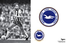
And here's a comparison between our current badge and the 1970's revived..
I'd love to see the club start selling the club as the Team of Sussex, but I'm not holding my breath at the moment. I think they've missed a trick over the last few years.
Two points:
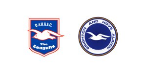
Still can't believe how shocking the current badge is.
Not convinced by the cartoon seagull on the badge. I still think keep the round design, love the gold but the bird needs refreshing.