Got something to say or just want fewer pesky ads? Join us... 😊

The Away kit?


Fulking Seagull

New member
Mar 31, 2013
103
Fulking
She wore, she wore, she wore a yellow ribbon, she wore a yellow ribbon in the merry month of May; and when I asked her why she wore that ribbon, she said it was for Brighton and we're going to Wembley....

Happy days


Bob!

Coffee Buyer
Jul 5, 2003
11,618
I can remember when it was a green (or yellow ) pollo neck jumper. It was colder then.

Yellow was just for International matches though, wasn't it?


strings

Moving further North...
Feb 19, 2006
9,969
Barnsley
Goalkeepers only. Do you remember the days when keepers wore a green shirt, then the same colour shorts and socks as the rest of the team?

Love to go back to those days.

Fulham were still doing this until very recently (not necessarily green shirt, but having the keeper in the same shorts and socks as outfield players). I agree, much prefer keepers to have same shorts and socks as their teammates.


rocker959

Well-known member
Jan 22, 2011
2,802
Plovdiv Bulgaria
Goalkeepers only. Do you remember the days when keepers wore a green shirt, then the same colour shorts and socks as the rest of the team?

Love to go back to those days.

Likewise .


Not Andy Naylor

Well-known member
Dec 12, 2007
8,984
Seven Dials
Whatever it is, it can't be more horrific than the shocking abomination of the first choice kit which looks like 3 shirts stitched together with bits left over on the factory floor.

Everything about the Albion in recent years suggests taking care of the fine details - from the Amex, to Lancing, even to the promotion parade. And then inexplicably they unveil a shirt that looks like it was knocked up at five to five on a Friday before a long weekend. It seems to be getting a free pass because the sponsor isn't an iron-on panel - but as an overall design concept it is a complete shocker and one of our worst shirts in recent memory - and that's saying something.

If the sleeves were solid blue it would be better, admittedly. But having some stripes on the back is a big plus for me.


Nixonator

Well-known member
Feb 8, 2016
6,737
Shoreham Beach
Whatever it is, it can't be more horrific than the shocking abomination of the first choice kit which looks like 3 shirts stitched together with bits left over on the factory floor.

Everything about the Albion in recent years suggests taking care of the fine details - from the Amex, to Lancing, even to the promotion parade. And then inexplicably they unveil a shirt that looks like it was knocked up at five to five on a Friday before a long weekend. It seems to be getting a free pass because the sponsor isn't an iron-on panel - but as an overall design concept it is a complete shocker and one of our worst shirts in recent memory - and that's saying something.

Tell us what you really think. It'll grow on you, esp with the names and numbers on the back it won't look as messy. Only thing I don't like are the sleeves, they should have just been our standard blue and not the pin striped halftone.

Last season's kit took a bashing as well and I think it's decent.


el punal

Well-known member
Aug 29, 2012
12,531
The dull part of the south coast
I can remember when it was a green (or yellow ) pollo neck jumper. It was colder then.

And a flat cap . . . and the goalie was called Tubby!

If I'm right, goal keepers in League and Cup games had to play in green jerseys with shorts/socks the same as the rest of the team. There was a brief period when goalies were allowed to wear all green kit (late 1960s?) and that was stopped after a short spell. International goalies played in yellow jerseys.

I'll go back to bed now! :yawn: :smile:


Surf's Up

Well-known member
Jul 17, 2011
10,432
Here
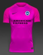
So, seeing as we've got naff all to do because we've already STROLLED our way to the promised land. What do we think the away kit(s)? will be like?

My guess is that Paul Barber has had to sell one of his children to the Nike sweatshops to have them give us a home shirt without a plastic panel. So I'd say it's a safe bet that our away kit will be straight out of the teamwear catalogue.

So, colour. In line with the swoosh on the home shirt and even the TERTIARY COLOUR of the streamers at the promotion parade, I'm confident that we'll go for YELLOW.

And so, through the power of modern technology, I'm able to give you the first look at next season's away shirt. The £12.71 Nike Trophy III Jersey complete with Amex and BHA branding. Yours for only £69+VAT (not including postage)

:albion:

View attachment 85757

I like this but yellow/mustard are SO not my colours.


Cowfold Seagull

Fan of the 17 bus
Apr 22, 2009
22,111
Cowfold
She wore, she wore, she wore a yellow ribbon, she wore a yellow ribbon in the merry month of May; and when I asked her why she wore that ribbon, she said it was for Brighton and we're going to Wembley....

Happy days

Sounds more like that little ditty should have been sung in 1883 than 1983 really.


Marmaduke

SE London Seagull
Apr 28, 2010
173
SE London
Whatever it is, it can't be more horrific than the shocking abomination of the first choice kit which looks like 3 shirts stitched together with bits left over on the factory floor.

Everything about the Albion in recent years suggests taking care of the fine details - from the Amex, to Lancing, even to the promotion parade. And then inexplicably they unveil a shirt that looks like it was knocked up at five to five on a Friday before a long weekend. It seems to be getting a free pass because the sponsor isn't an iron-on panel - but as an overall design concept it is a complete shocker and one of our worst shirts in recent memory - and that's saying something.

Haha. I can imagine you weeping and banging the table as you wrote that.

I actually quite like it. Better that last season's


One Teddy Maybank

Well-known member
NSC Patron
Aug 4, 2006
22,961
Worthing
Whatever it is, it can't be more horrific than the shocking abomination of the first choice kit which looks like 3 shirts stitched together with bits left over on the factory floor.

Everything about the Albion in recent years suggests taking care of the fine details - from the Amex, to Lancing, even to the promotion parade. And then inexplicably they unveil a shirt that looks like it was knocked up at five to five on a Friday before a long weekend. It seems to be getting a free pass because the sponsor isn't an iron-on panel - but as an overall design concept it is a complete shocker and one of our worst shirts in recent memory - and that's saying something.

Feel completely the opposite, really like it and just ordered it.


Sent from my iPhone using Tapatalk


TWOCHOICEStom

Well-known member
Sep 22, 2007
10,899
Brighton
Whatever it is, it can't be more horrific than the shocking abomination of the first choice kit which looks like 3 shirts stitched together with bits left over on the factory floor.

Everything about the Albion in recent years suggests taking care of the fine details - from the Amex, to Lancing, even to the promotion parade. And then inexplicably they unveil a shirt that looks like it was knocked up at five to five on a Friday before a long weekend. It seems to be getting a free pass because the sponsor isn't an iron-on panel - but as an overall design concept it is a complete shocker and one of our worst shirts in recent memory - and that's saying something.

Worst shirts in recent memory? Disagree totally sorry. Every Nike shirt we've had so far has been worse than this IMO. I really dislike Nike, but this shirt is class. The arms look great, there are stripes on the back and the touches of yellow are nice (though they could/should have been red)

I respect that you might not like the design, but given the look of 99% of Nike's shirts I'd say we've done very well to get such a nice looking kit. Also, though I joke. Not getting an iron-on panel is a massive achievement from PB. I literally cannot find a single example where they've done this for another club.


Husty

Mooderator
Oct 18, 2008
11,998
Worst shirts in recent memory? Disagree totally sorry. Every Nike shirt we've had so far has been worse than this IMO. I really dislike Nike, but this shirt is class. The arms look great, there are stripes on the back and the touches of yellow are nice (though they could/should have been red)

I respect that you might not like the design, but given the look of 99% of Nike's shirts I'd say we've done very well to get such a nice looking kit. Also, though I joke. Not getting an iron-on panel is a massive achievement from PB. I literally cannot find a single example where they've done this for another club.

Are you colour blind? I reckon their must be a correlation between that and people thinking two different shades of blue on our shirts looks anything other than horrendous.


Dick Head

⭐⭐⭐⭐⭐
Jan 3, 2010
13,882
Quaxxann
away kit 2017.jpg


Albion and Premier League latest from Sky Sports


Top
Link Here