TWOCHOICEStom
Well-known member
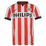
It is all to do with the 'exclusion zone' around the Amex logo, I thought. For example if it is on a striped background, there needs to be a single colour box around the 'American Express' text. If the background is plain (see last season's Goalie and training shirts) there doesn't need to be a box around the text.
Correct. It's all to do with Amex's branding guidelines. They can't have their logo on a mixed background so a panel it is. Nike will never ever ever integrate the sponsor into the shirt like Errea did for us. They don't do it with Barca or Juventus, so we'll be having a panel on every home shirt for the foreseeable future.
I think, judging by the feedback the club must have received, a good way to sell more away kits will be to have a shirt design which doesn't require a panel. I.e a plain shirt.
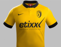
The two I think would sell like HOTCAKES are these (in yellow)


