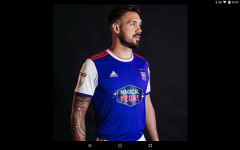
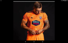
As disgusting as all those are surely that would be goalkeeper instead of 3rd?
You are using an out of date browser. It may not display this or other websites correctly.
You should upgrade or use an alternative browser.
You should upgrade or use an alternative browser.
[Football] New Kits 2018/19
- Thread starter Alba Badger
- Start date
More options
Who Replied?Cowfold Seagull
Fan of the 17 bus
I want a collar. apart from that like the proposed kit
Should have gone to Specsavers. I feel
TWOCHOICEStom
Well-known member
Those are just concepts by somebody with Photoshop. And IMO, they're awful.
I think we can expect something half decent this year actually. Nike seem to have 3 main groups of teams.
- City, Chelsea, Spurs and big international teams
They get fully custom versions and a fashion range to match. They're the only ones who get the player versions of the shirts with the vapour technology (the 90 quid england shirt for example)
- Smaller International Teams, BHA , Chinese superleague teams...
We get basically teamwear from the catalog with either bespoke colours or a change of a core pattern. For example, our current home kit is pretty much available as teamwear, we just got the luxury of our own stripes The away kit is teamwear in a different colour. NO vapour kits, no player versions, no fashion range.
- Coventry, Dundee United, Leyton Orient etc...
Teamwear PLEBS. 14 quid shirts sold for 40 with a sponsor and a badge slapped on.
The Chinese Super League kits are actually pretty decent this year. I think we can expect something along these lines. A bit of flair would be nice for a change!
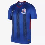
https://www.footyheadlines.com/2018/05/all-32-nike-chinese-super-league-2018-kits.html
I think we can expect something half decent this year actually. Nike seem to have 3 main groups of teams.
- City, Chelsea, Spurs and big international teams
They get fully custom versions and a fashion range to match. They're the only ones who get the player versions of the shirts with the vapour technology (the 90 quid england shirt for example)
- Smaller International Teams, BHA , Chinese superleague teams...
We get basically teamwear from the catalog with either bespoke colours or a change of a core pattern. For example, our current home kit is pretty much available as teamwear, we just got the luxury of our own stripes The away kit is teamwear in a different colour. NO vapour kits, no player versions, no fashion range.
- Coventry, Dundee United, Leyton Orient etc...
Teamwear PLEBS. 14 quid shirts sold for 40 with a sponsor and a badge slapped on.
The Chinese Super League kits are actually pretty decent this year. I think we can expect something along these lines. A bit of flair would be nice for a change!

https://www.footyheadlines.com/2018/05/all-32-nike-chinese-super-league-2018-kits.html
Those are just concepts by somebody with Photoshop. And IMO, they're awful.
I think we can expect something half decent this year actually. Nike seem to have 3 main groups of teams.
- City, Chelsea, Spurs and big international teams
They get fully custom versions and a fashion range to match. They're the only ones who get the player versions of the shirts with the vapour technology (the 90 quid england shirt for example)
- Smaller International Teams, BHA , Chinese superleague teams...
We get basically teamwear from the catalog with either bespoke colours or a change of a core pattern. For example, our current home kit is pretty much available as teamwear, we just got the luxury of our own stripes The away kit is teamwear in a different colour. NO vapour kits, no player versions, no fashion range.
- Coventry, Dundee United, Leyton Orient etc...
Teamwear PLEBS. 14 quid shirts sold for 40 with a sponsor and a badge slapped on.
The Chinese Super League kits are actually pretty decent this year. I think we can expect something along these lines. A bit of flair would be nice for a change!
https://www.footyheadlines.com/2018/05/all-32-nike-chinese-super-league-2018-kits.html
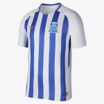
Looking at the kits on that link this one looks like it might be a potential candiate:
GoingUp
Well-known member
The MLS seem to all have bespoke kits, they got some real nice 'jerseys' 

- Jul 7, 2003
- 48,298
Very classy
Glorious. A shame it will only ever be seen on NZ television as they smash 17 goals past Vanuatu in the next major tournament qualifier.
Those shorts are a bold move.
Papa Lazarou
Living in a De Zerbi wonderland
Red and blue are colours that need to be kept a long way apart.
Worth remembering the snake rhyme :
Red next to Black is a friend of Jack.
Red next to Blue or Yellow could kill a fellow.
Barcelona can get away with playing in any colours under the sun, they are super successful, and play such beautiful football.
Palarse on the other hand . . .
This last post was going to be my contribution to this discussion thread. Someone at SCCC either is a Palace fan or doesn't understand colour combos.
Papa Lazarou
Living in a De Zerbi wonderland
Hmmm...well I want a couple of long-haul holidays a year, a DB9, and a threesome with Mylene Klass and Fiona Bruce. Sadly though, I just don't have the money (Fiona was particularly unrealistic and inflexible in her demands, I felt).
So, Mylene was up for it? Asking for a friend (of course) but what were her terms <ahem>?
Bevendean Hillbilly
New member
Easy 10
Brain dead MUG SHEEP
So, Mylene was up for it? Asking for a friend (of course) but what were her terms <ahem>?
Surprisingly modest.
No kissing, no direct eye contact, a pre-established 'safe word', and swift access to a post-coital beef and tomato Pot Noodle.
Not Andy Naylor
Well-known member
Yep, its a woeful combo.
Barcelona get away with it, as they kind of tone it down to a deeper, more understated rouge and blue. Not Palace though. They turn up the contrast FULL BLAST, almost reminiscent of a 1970's TV screen when someone has just upgraded from black and white, and want to milk all the colour out of it they possibly can. Ugh.
It was all Malcolm Allison's doing. He wanted the team to look like Barcelona but neglected to make them play like them. Pre-Allison they wore some rather unusual variations on claret and blue.
Easy 10
Brain dead MUG SHEEP
It was all Malcolm Allison's doing. He wanted the team to look like Barcelona but neglected to make them play like them. Pre-Allison they wore some rather unusual variations on claret and blue.
Its a truly foul combo though, isn't it ? This isn't just my natural anti-CPFC2010 bile coming out, I truly feel their kit is utterly VILE. Is it ever mentioned in the press corps ? Surely someone amongst the journo's has at some point said "jesus...what in the name of frig are this lot wearing"
Not Andy Naylor
Well-known member
Its a truly foul combo though, isn't it ? This isn't just my natural anti-CPFC2010 bile coming out, I truly feel their kit is utterly VILE. Is it ever mentioned in the press corps ? Surely someone amongst the journo's has at some point said "jesus...what in the name of frig are this lot wearing"
Personally I think it's the yellow that pushes it off the edge. They had yellow bits on the early 70s shirts, which looked quite cool with claret and blue but is horrible with the red and blue they have now. Actually I'm not aware of any opinions about kit in the press box beyond whether the numbers are readable - which make QPR and Reading every journo's least favourite kits.
Easy 10
Brain dead MUG SHEEP
Personally I think it's the yellow that pushes it off the edge. They had yellow bits on the early 70s shirts, which looked quite cool with claret and blue but is horrible with the red and blue they have now. Actually I'm not aware of any opinions about kit in the press box beyond whether the numbers are readable - which make QPR and Reading every journo's least favourite kits.
Second or third season at the Amex, the BHA kit wasn't too clever either if I recall. Yellow names and numbers with no panel, printed straight onto the stripes. I bloody struggled with that from the WSU.
Blue Valkyrie
Not seen such Bravery!
Yellow and Red, please.I just hope our away kit has stripes. we play in stripes, playing in a solid colour away from home takes away a bit of our identity. Stripes for all the kits please.
Or a return to the AC Milan Red and Black.
Ludensian Gull
Well-known member
Tom Bombadil
Well-known member
That Ipswich home shirt is terrible.
DarrenFreemansPerm
⭐️⭐️⭐️⭐️
That Ipswich home shirt is terrible.
Utterly village standard.


