Eggman
Well-known member
I thought ironed-on sponsor's logos looked SHIT?
Is it hell.
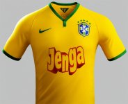
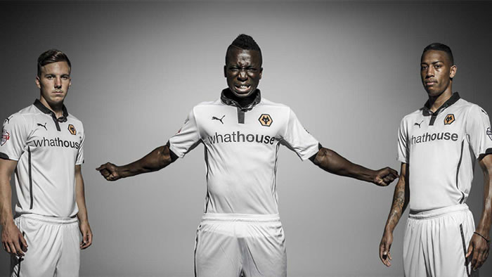
The collar looks like it will be out of shape after wearing it twice, and the sponsor panel looks ridiculous - either cut out each letter, OR have a background panel - having that vague shape cut around it (with a background colour completely different to the shirt colours) looks terrible. In my opinion, obviously.
I like the stripes is what I meant. Not a fan of our sleeves and solid blue back.


