BBassic
I changed this.
- Jul 28, 2011
- 13,444
What on earth were Middlesbrough thinking? That is dismal. Really like the Forest one, which goes to show what can be done with a plain red shirt design (it's much better than the red and gold abomination they had this season). But Boro...I just can't imagine somebody at the Riverside actually signing that off. It looks awful.
The Boro away kit uses the Ipswich design and is a little better. Can't work out what's going on with the model in the middle though. At first I thought it was a woman, maybe one of their ladies' team, but then I realised the legs and body were a bloke's. The head looks photoshopped on, and too small for the rest of the photo. Is that actually one of their (male) players??

same, at least the sponsor logo isn't dominating the front of the shirt so much as well.From the photo released I actually quite like that.

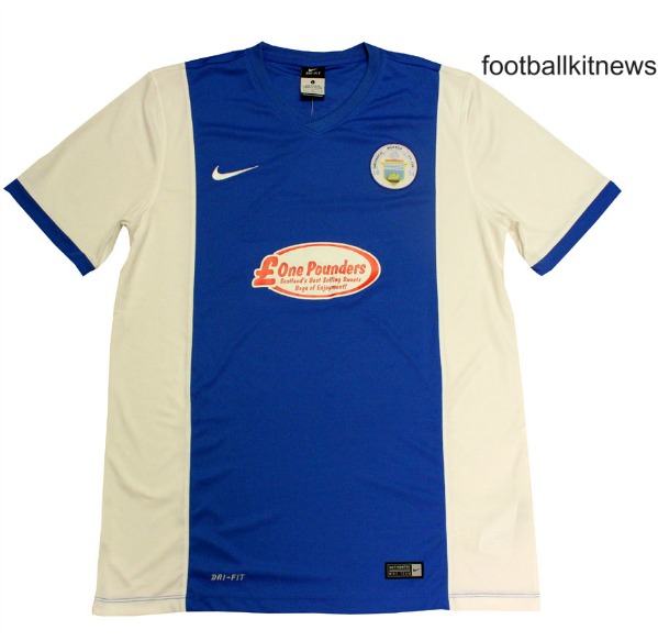
Worst sponsor logo, ever? Nasty looking kit too.
Greenock Morton.


Bradford City
Sent from my iPhone using Tapatalk
oThe effeminate one in the middle I think is called Gaston
Wigan's new strip, as modelled by Will Grigg. Fire not included.
Now, change the sponsor for something less crap, and swap the red trim for yellow, and this wouldn't be half bad.

Loving those
Perhaps next time he's asked to do something like that, he should ask his guide dog's opinion before he submits his work.My friend helped design them! I'll pass on the words
Sent from my iPad using Tapatalk

Bradford City
Sent from my iPhone using Tapatalk
I quite like all three of these. They've tried something a bit different which makes a nice change. It annoys me more when clubs change the stripe width by 2mm and try and charge people all over again for a "new" kit!Bradford City
Sent from my iPhone using Tapatalk
