sten_super
Brain Surgeon
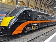
Well my first experience of the new operator (branded as Great Northern, at least for now) has been reassuringly shit.
They'd taken the time to make sure that the ticket machine was nicely re-branded as Great Northern. Unfortunately it was the same shitty 1980s train that picked me up and took me into Cambridge this morning...
...and I've just spent the past hour trying to buy a ticket online. I generally found FCC to be okay in this area - they had a good mobile app and an easy-to-use website and booking system. Unfortunately Great Northern have got neither. Despite having a brand spanking new app, it doesn't let you actually buy tickets - it simply directs you to the mobile version of the website. Highlights of the website included being offered approximately 8 million different ticketing options for one return journey (including open returns when I'd specifically said I was travelling out and back the same day), a random box on the booking form entitled 'Mobile Phone' with no explanation (I ticked it of course) and it refusing to accept my card for half an hour (until it then decided to work with precisely the same details).
Now, to top it off, I've had a booking email simply entitled 'Booking confirmation and receipt', with the booking reference hidden half way down the email (on the right hand side). Compared to FCC (where the reference was in the email subject, and then top middle in big bright lettering in the email) it's an absolute shower of shit.


