pigmanovich
Good Old Sausage by the Sea
On the subject of Spurs, there are just taking the piss now:
Why is the Nike swish standing on it's...head?...tail?...
Nike swish aside I don't mind this design.
On the subject of Spurs, there are just taking the piss now:
Why is the Nike swish standing on it's...head?...tail?...
Of rather more concern should be why the Nike design team thought WW2 concentration camp uniform was an acceptable lookHa. Same.
And I looked and looked, and couldn't understand HOW they've ended up with it like that.
But I have sussed it now - it is because the ball itself is not centred, within the overall width of the club badge.
So the designer has logically clicked 'centre' on the badge, then clicked 'centre' on the sponsor logo - and ended up with this WRONGNESS.
My O-level Art teacher once taught me that in design, 'if it LOOKS right, then it IS right'. This guy clearly had a different art teacher...
I see Canada are going with an all new Nike format for their new shirt, the tick in an oval, and very different template format
View attachment 183214
March over Mbappe everytime lol.Er... the 'obvious answer' is to not get a name/number on the back until details are confirmed.
The club can't confirm numbers early because agents of new signings might demand a specific number.
I mean, I'd be frigging annoyed if Mbappe turned us down because March has his No.7 shirt...
Of rather more concern should be why the Nike design team thought WW2 concentration camp uniform was an acceptable look
Japan's new kit Y3 looks amazing.
I don’t like it, and even if it wasn’t them I still wouldn’t like it.
I don’t like it, and even if it wasn’t them I still wouldn’t like it.

I don’t like it, and even if it wasn’t them I still wouldn’t like it.
Doubt it. Fans will wear any old bit of polyester shit just so long as it's official and overpriced by about fifty quidI’m actually going to assume their fans won’t be to impressed with this

Ignoring that it is Palace for a moment... what is it about this shirt, (apart from the blurred stripes, messy background pattern, horrible clashing colours, comedy badge, and the big logo of a dodgy betting firm) that you don't like?Without doubt the shittest kit I have ever seen. They deserve it
The collar is pretty shit.Ignoring that it is Palace for a moment... what is it about this shirt, (apart from the blurred stripes, messy background pattern, horrible clashing colours, comedy badge, and the big logo of an illegal betting firm that run books on cockfighting) that you don't like?
Oh there's a memory I forgot I had. Downloading different visualisations and skins for the WinAmp player so it looked like a retro stereo.It looks like a WinAmp Visualisation from the 90s.

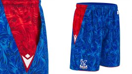
Also should point out that the ‘pattern’ continues and is carried over to the shorts.Ignoring that it is Palace for a moment... what is it about this shirt, (apart from the blurred stripes, messy background pattern, horrible clashing colours, comedy badge, and the big logo of an illegal betting firm that run books on cockfighting) that you don't like?
They’re truly rank!Also should point out that the ‘pattern’ continues and is carried over to the shorts.