You are using an out of date browser. It may not display this or other websites correctly.
You should upgrade or use an alternative browser.
You should upgrade or use an alternative browser.
Can we have this kit next season please?
- Thread starter fire&skill
- Start date
More options
Who Replied?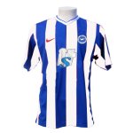
Beach Hut
Brighton Bhuna Boy
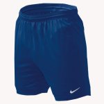
I would certainly advocate the dark blue shorts, white ones are naff
dougdeep
New member
Seconded.
BensGrandad
New member
Hope not the shorts and socks are awful. We are BHA not Sheffield Wednesday, as the shorts are nearly black. If we must have blue shorts make them the same colour blue as the stripes of the shirts but I think white look much more classy.
Tony Meolas Loan Spell
Slut Faced Whores
YES!!!
With striped backs as well. WINNER!
With striped backs as well. WINNER!
fire&skill
Killer-Diller
- Thread starter
- #7
Hope not the shorts and socks are awful. We are BHA not Sheffield Wednesday, as the shorts are nearly black. If we must have blue shorts make them the same colour blue as the stripes of the shirts but I think white look much more classy.
Agreed BG. Didn't really notice the difference but I am a bit of a novice with 'Photoshop'.
Still a bigger fan of the blue shorts and socks than the white though - especially as some of our greatest recent moments have been in that colour combination
cw00
New member
yes looks good, think the red nike logo looks a bit tacky, should be black or blue. and shorts or socks should have some strips on them at least, not just all blue (boring)
 tho I'd prefer adidas or reebok to Nike
Miami Seagull
Grandad
I agree too. 100%, always preferred the old badge too. I know the new one was created to move away from the old board when DK took over (wasnt it?), but the badge goes back way before them...
Nobby's Betamax Video
New member
Got to be Adidas, they KNOW football and are at least European. For me, Nike are usurpers, don't have the tradition and most probably their execs refer to our beautiful game as Soccerball......damn yanks!

Like the kit though...with a stripe down the middle though as Ev said.
Like the kit though...with a stripe down the middle though as Ev said.
Personally I'm not mad keen on any of that. A bit too Nike running and not enough old school football for me. Prefer white shorts and the lower v neck with thinner stripes.
bristolseagull
Well-known member
like we're ever going to have a kit made by Nike, get a grip
Hunting 784561
New member
- Jul 8, 2003
- 3,651
The stripe should be centred under the V neck collar.
Wigan's shirt from last season is the best blue and white striped shirt ever IMHO

Wigan's shirt from last season is the best blue and white striped shirt ever IMHO
Forster's Armband
Well-known member
Like the darker blue stripes, round badge and the collar. I would like the club to get Umbro to make the kit as they have a great range of retro looking kits - England, Man City and West Brom spring to mind.
jimmypbha
New member
Looks quite good.
