Got something to say or just want fewer pesky ads? Join us... 😊

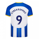
[Albion] Simple straw poll: New Home Shirt - YAY/NAY ?

New Home Shirt

  • YAY

    Votes: 96 15.8%
  • NAY

    Votes: 403 66.5%
  • M-EH

    Votes: 107 17.7%

  • Total voters
    606


DarrenFreemansPerm

⭐️⭐️⭐️⭐️
Sep 28, 2010
17,452
Shoreham
The more I see the new one, the less I like it.

That said, is it possible that a poll on a site largely populated by middle aged blokes, a lot of whom wouldn't buy it whatever it looked like, might not be a representative sample of the fanbase?

I asked my younger brother (22) his thoughts on it. He thinks it’s an absolute joke. A browse on Twitter tells me the youth think it’s absolute crap too. It’s not just us old farts, it’s almost everyone that thinks it’s pony.


elwheelio

Amateur Sleuth
Jan 24, 2006
1,957
Brighton
I'm in my 40s, wouldn't buy a shirt if I did like it to be honest. However, that home shirt is ****.


bobbysmith01

Well-known member
Feb 6, 2015
806
I am perplexed by why people CARE so much.
It's blue and it's white and I'll be able to see which players are Brighton and which aren't.
All good.

But then I am with Charlie Brooker on fashion:

https://www.theguardian.com/commentisfree/2007/apr/30/fashion.comment

'As far as I can tell, fashion is nothing more than a handy visual system that gives people with no personality some palpable criteria to judge each other by. Anyone who regularly contemplates clothing for more than five minutes a week is wasting their life as surely as the most lethargic, do-nothing heroin addict imaginable'.

Totally agree mate, we have some very sad fans getting obsessed with kit design? Let's worry about the team and how it performs.


Sent from my iPhone using Tapatalk


Kalimantan Gull

Well-known member
Aug 13, 2003
13,458
Central Borneo / the Lizard
Well, I'm meh rather than nah as I'm going to be supporting the team playing in those shirts for the whole of the next year, and I don't want to be overly negative.

But I was going to buy a new home shirt this year, but now I think I'll give it a skip


Garry Nelson's Left Foot

Well-known member
Jul 7, 2003
13,536
tokyo
It's a horrible, horrible looking kit. Every part is a fail from the white shorts and socks to the thick stripes, the giant 'H' and the fugly yellow trim and pinstripes.

My initial reaction was that it was the worst home kit of my Albion supporting life time. Then I had a look at this website:

https://www.footballkitarchive.com/brighton-kits/

Turns out it's got some stiff competition. We've had some really poor kits over the years. Why and how we've consistently ****ed up a very simple idea is beyond me.

We've had those thick stripes three times in the last ten years and each time the kit has looked shit. The Argentina shirt was a wrong'un too. But the three that I think challenge this years for the worst kit of the past 30 years are the 2010/11 one(I know we one the league in it but it's an ugly ******* of a shirt), the 97/98 shirt (although we were homeless and 91st in the league so a nice kit was the least of our worries) and the 93/94 kit with those very thin stripes.

If the Fan Advisory Board do nothing else please, please, please can they get the club to sign off on a decent kit.


hans kraay fan club

The voice of reason.
Helpful Moderator
Mar 16, 2005
62,771
Chandlers Ford
Regards the whole 'H' thing - either you tell American Express that we don't want their money anymore, or you accept this as a consequence.

People can post as many Sheffield Wednesday or WBA kits as they like, and moan that ours should like like them - but Amex will simply never accept their logo on anything other than a plain background.

So the only way to avoid the block panel, that creates the H, is to have a non-striped shirt. Which they did two seasons ago, and produced a thing of beauty - that every ****er on here STILL cried like a bitch about.

:shrug:


Wozza

Custom title
NSC Patron
Jul 6, 2003
24,392
Minteh Wonderland
Regards the whole 'H' thing - either you tell American Express that we don't want their money anymore, or you accept this as a consequence...

So the only way to avoid the block panel, that creates the H, is to have a non-striped shirt.

:shrug:

Nah, the 'H' thing is only an issue when we have three thick stripes - and even then, only when white is on the outside.

Easily avoidable.


DarrenFreemansPerm

⭐️⭐️⭐️⭐️
Sep 28, 2010
17,452
Shoreham
Regards the whole 'H' thing - either you tell American Express that we don't want their money anymore, or you accept this as a consequence.

People can post as many Sheffield Wednesday or WBA kits as they like, and moan that ours should like like them - but Amex will simply never accept their logo on anything other than a plain background.

So the only way to avoid the block panel, that creates the H, is to have a non-striped shirt. Which they did two seasons ago, and produced a thing of beauty - that every ****er on here STILL cried like a bitch about.

:shrug:

Or just have a normal striped shirt, which doesn’t have an enormous H on the front.
A093D76F-1CB2-4E14-9E78-231ACA88CD3A.jpeg

This isn’t about the American Express sponsor, it’s the absolute dog’s dinner of a design, the front is crap, the back is crap and the unnecessary overuse of yellow is crap.


Soul Finger

Well-known member
May 12, 2004
2,297
I just clicked 'Yay' by mistake.

Can I let it be known, for the record, that I think this is the worst shirt in the history of this magnificent football club.

Looks like a junior school art project. And not the winning effort either.

I don't wear replica shirts but I still want us to look the business.

I am absolutely flabbergasted by how poor it is.


Brovion

In my defence, I was left unsupervised.
NSC Patron
Jul 6, 2003
19,888
I just dont understand why such a commercially important product for the club isn't focus grouped by a broad set of customer demographics before being chosen. It's absolute marketing basics. Looks like this one is going to be a very expensive mistake.

I think, as a couple of us have alluded to, it must be deliberate. Make it really shit, enough mug punters (sorry, 'loyal supporters') will buy it anyway to make it commercially worthwhile, and then next year's kit will be a design masterpiece in comparison which everyone will rave over.


Sarisbury Seagull

Solly March Fan Club
NSC Patron
Nov 22, 2007
15,028
Sarisbury Green, Southampton
Regards the whole 'H' thing - either you tell American Express that we don't want their money anymore, or you accept this as a consequence.

People can post as many Sheffield Wednesday or WBA kits as they like, and moan that ours should like like them - but Amex will simply never accept their logo on anything other than a plain background.

So the only way to avoid the block panel, that creates the H, is to have a non-striped shirt. Which they did two seasons ago, and produced a thing of beauty - that every ****er on here STILL cried like a bitch about.

:shrug:

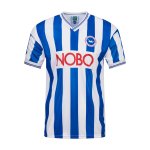
A plain white sponsors background, no H and a thing of beauty:

Nobo kit.jpg

I agree with you on the blue one with pinstripes from a couple of years back, I loved that kit!


Albion and Premier League latest from Sky Sports


Top
Link Here