You are using an out of date browser. It may not display this or other websites correctly.
You should upgrade or use an alternative browser.
You should upgrade or use an alternative browser.
[NSC] Pop-up ads at bottom of page
- Thread starter schmunk
- Start date
More options
Who Replied?Same, Chrome on iPhone, logged in
Joey Jo Jo Jr. Shabadoo
I believe in Joe Hendry
- Oct 4, 2003
- 12,063
Same on Safari on my iPhone.
To save a load of posts the boss tells me this is a new thing and currently only on mobile. I’ll let him explain more (or not) but for now you’ll get it on mobile and not on p.c.
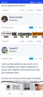
Whatever is needed to generate income but...my God it's annoying. Pops up every time you change page and makes me think I'm seeing things out of the corner of my eye.
I'm surprised the dissent took this long - I turned it on around 3:30!
It's just an experiment which I knew would be unpopular.
Ads now pay primarily on viewability so the regular banners deployed on the site are relatively poor payers are they aren't on screen often/for very long - c57%. In contrast the sticky bottom banner, which has been used for non-logged in users for a while, gets seen 88% of the time.
I thought it would be less intrusive on mobile, rather than desktop, but I wonder if the opposite is true.
That style of ad is used on a lot of sites, but maybe it's the way it appears, instead of being there when the page renders, which makes it more jarring.
Biscuit Barrel
Well-known member
Please remove the adds. It is driving me mad.
Cheshire Cat
The most curious thing..
it's bloody irritating, especially on a phone obscuring part of a comparatively small screen.I'm surprised the dissent took this long - I turned it on around 3:30!
It's just an experiment which I knew would be unpopular.
Ads now pay primarily on viewability so the regular banners deployed on the site are relatively poor payers are they aren't on screen often/for very long - c57%. In contrast the sticky bottom banner, which has been used for non-logged in users for a while, gets seen 88% of the time.
I thought it would be less intrusive on mobile, rather than desktop, but I wonder if the opposite is true.
That style of ad is used on a lot of sites, but maybe it's the way it appears, instead of being there when the page renders, which makes it more jarring.
It makes NSC look like an unreadable newspaper free website, with random popups all over.
Everyone having a busy afternoon working hardI'm surprised the dissent took this long - I turned it on around 3:30!

bluenitsuj
Listen to me!!!
Are we getting rid of them?
- May 8, 2018
- 10,623
Ludensian Gull
Well-known member
Bloody annoying
oldboyroy
Well-known member
Same here on my Samsung galaxy.......had to check I was on nsc
Normal Rob
Well-known member
Attachments
schmunk
Why oh why oh why?
- Thread starter
- #19
A static banner ad of the same size would be (I think) less annoying, and visible 100% of the timeI'm surprised the dissent took this long - I turned it on around 3:30!
It's just an experiment which I knew would be unpopular.
Ads now pay primarily on viewability so the regular banners deployed on the site are relatively poor payers are they aren't on screen often/for very long - c57%. In contrast the sticky bottom banner, which has been used for non-logged in users for a while, gets seen 88% of the time.
I thought it would be less intrusive on mobile, rather than desktop, but I wonder if the opposite is true.
That style of ad is used on a lot of sites, but maybe it's the way it appears, instead of being there when the page renders, which makes it more jarring.


