TWOCHOICEStom
Well-known member
- Thread starter
- #81
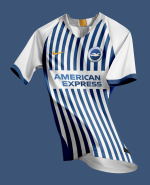
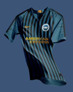
Top one is amazing and think the bottom one could work. Generally I’d think the blue would have to be different to the home tho, so like a darker, more green blue with black stripes, then for the home kit a slightly lighter royal blue with more magenta and white stripes. Kind of a personal preference I guess.
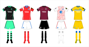
Then the tertiary red colour can work with both kit across stripes or not, but I’m partial to a panel anyway. Particularly a fan of the palace puma kits this season for that reason, that the design and palette is the same over the 3 kits pretty much, but with main colour being switched. Very smart.
Good work on your designs. Where do you make them?
That particular set I used a photoshop template you can get here: https://www.behance.net/gallery/68530435/NIKE-AEROSWIFT-2018-19-TEMPLATE-II
I tend to just grab a pic of some teamwear, or and existing kit then butcher it in Photoshop until I come up with something I like. I'm no graphic designer though, they'd cry if they saw the file structure! The thing I find so interesting about Nike as a manufacturer is that is is possible to guess what kit we'll actually get. They only give teams like us a certain set of base structures and options. It makes it good fun to try to second guess them.
Gonna upload some more designs later. Red away could be very nice!


