Got something to say or just want fewer pesky ads? Join us... 😊

New olympic logo CRAP!!


Garry Nelson's Left Foot

Well-known member
Jul 7, 2003
13,533
tokyo
What I can't understand is how people can come to the following conclusions after having seen it:


It will define the venues we build and the Games we hold and act as a reminder of our promise to use the Olympic spirit to inspire everyone and reach out to young people around the world.

It is an invitation to take part and be involved.Seb Coe

This is a truly innovative brand logo that graphically captures the essence of the London 2012 Olympic Games - namely to inspire young people around the world through sport and the Olympic values...the brand launched today by London 2012 is, I believe, an early indication of the dynamism, modernity and inclusiveness with which London 2012 will leave its Olympic mark. IOC president, Jacques Rogge

This is an iconic brand that sums up what London 2012 is all about - an inclusive, welcoming and diverse Games that involves the whole country.

"It takes our values to the world beyond our shores, acting both as an invitation and an inspiration. Olympic Minister Tessa Jowel

The new Olympic brand draws on what London has become - the world's most forward-looking and international city.
Ken Livingstone


beorhthelm

A. Virgo, Football Genius
Jul 21, 2003
36,029
go to the designers site and see a larege blown up version... the lines arent even straight. it looks like its been done free hand in paintbrush.


Garry Nelson's Left Foot said:
What I can't understand is how people can come to the following conclusions after having seen it:


It will define the venues we build and the Games we hold and act as a reminder of our promise to use the Olympic spirit to inspire everyone and reach out to young people around the world.

It is an invitation to take part and be involved.Seb Coe

This is a truly innovative brand logo that graphically captures the essence of the London 2012 Olympic Games - namely to inspire young people around the world through sport and the Olympic values...the brand launched today by London 2012 is, I believe, an early indication of the dynamism, modernity and inclusiveness with which London 2012 will leave its Olympic mark. IOC president, Jacques Rogge

This is an iconic brand that sums up what London 2012 is all about - an inclusive, welcoming and diverse Games that involves the whole country.

"It takes our values to the world beyond our shores, acting both as an invitation and an inspiration. Olympic Minister Tessa Jowel

The new Olympic brand draws on what London has become - the world's most forward-looking and international city.
Ken Livingstone

Presumably they hadn't seen the potato priint either


I think you've all missed his irony here.

"This is an iconic brand that sums up what London 2012 is all about "

You know, I think he's got that right.

It does sum up what London 2012 is all about.

Its shit.


ali jenkins

Thanks to Guinness Dave
Feb 9, 2006
9,896
Southwick
What was wrong with the OLD one with the colours running through the letters to look like the THAMES which people accosiate with LONDON?
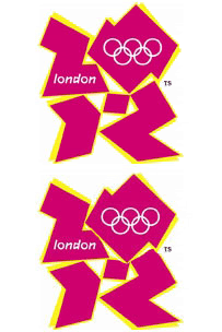


adrian29uk

New member
Sep 10, 2003
3,389
How much was this crap?

Seems to me its been slapped together in about 5 minutes flat, its bloody embarrassing.

As always the people in charge think its great, because they where sent samples they agreed it.

So as far as

http://www.wolff-olins.com/

is concerned there job is done and there laughing all the way to the bank.

As always with this country, the thing is a shambles before its even started.


Dick Knights Mumm

Take me Home Falmer Road
Jul 5, 2003
19,736
Hither and Thither
I don't think we are going to shake off the blow-job image. From the Guardian Fiver:

"A little off topic, but am I the only one who thinks that the new Olympics logo looks like Lisa Simpson going down on her brother?"


Normal Rob

Well-known member
Jul 8, 2003
5,797
Somerset
he he he...

london-copy.gif


Robot Chicken

Seriously?
Jul 5, 2003
13,154
Chicken World
Fantastic


Dick Knights Mumm said:
I don't think we are going to shake off the blow-job image. From the Guardian Fiver:

"A little off topic, but am I the only one who thinks that the new Olympics logo looks like Lisa Simpson going down on her brother?"

All references to Lisa Simpson have been removed from the 606 board-there were frigging loads...that thread will be looking a bit lighter now.

Just heard Seb Coe saying "We don't do bland". No you fuckwit-you do CRAP.


Cian

Well-known member
Jul 16, 2003
14,262
Dublin, Ireland
Its not Lisa Simpson, its Macy Gray...

Company that designed that designed the BT Piper. Which was similarly shit, and expensive, and replaced a much better simpler logo.


Foolg

.
Apr 23, 2007
5,024
Nemesis said:
Wonder how much they paid for that load of shite?
JUST HEARD ON RADIO ITS COST EM 400,000 QUID
ILL DO IT DEN TIMES BETTER 4 A HUNDRETH OF THAT


Albion and Premier League latest from Sky Sports


Top
Link Here