Got something to say or just want fewer pesky ads? Join us... 😊

New 2013/14 Kits thread


strings

Moving further North...
Feb 19, 2006
9,969
Barnsley
I really dislike the template that Fulham have used. I have seen several other clubs unveil kits in the same templete and they have all been terrible. But, may I say, the Fulham kit is lovely. The template just works in those colours. The red on the shorts and socks match really well with the sponsor and look like 'marathon' was designed to be on the shirts.

Top templating by Fulham and adidas.


strings

Moving further North...
Feb 19, 2006
9,969
Barnsley
My sons brand new Brighton away kit arrived today......lovely, except the plastic stick on badge which looks cheap.

Which badge? The club crest? The sponsor logo? I'm curious because I have issued my Dad with a club shop voucher and instructed him to purchase an away kit for me.

Glad the top is otherwise lovely, though.


countryman

Well-known member
Jun 28, 2011
1,893
The massive v under the Adidas template collars looks stupid. I really hope we don't get them next season. Another vote for Errea from me.


Buckley's Mad Eye

New member
Oct 27, 2012
1,393
Which badge? The club crest? The sponsor logo? I'm curious because I have issued my Dad with a club shop voucher and instructed him to purchase an away kit for me.

Glad the top is otherwise lovely, though.
The Seagull club crest. Looks like an afterthought,


brakespear

Doctor Worm
Feb 24, 2009
12,326
Sleeping on the roof
Villa away shirt, arguably one of the best new shirts this season:

380x450_fitbox-aston_villa_away_shirt_2013_14_c13000017_h.jpg
Like :thumbsup:


dejavuatbtn

Well-known member
Aug 4, 2010
7,581
Henfield
My sons brand new Brighton away kit arrived today......lovely, except the plastic stick on badge which looks cheap.

I quite liked the style and quality of the badge from the last couple of seasons - have they resorted to an iron on transfer sort of thing that's cheap and tacky? Ah, that's another smidgeon more profit from each shirt they sell. Quantity, not quality.


ozzygull

Well-known member
Oct 6, 2003
4,175
Reading
I quite liked the style and quality of the badge from the last couple of seasons - have they resorted to an iron on transfer sort of thing that's cheap and tacky? Ah, that's another smidgeon more profit from each shirt they sell. Quantity, not quality.

I got mine today. The badge is the same as last season and the American Express on the front is woven in as last years. The only iron thing is the small Amex logo on the back. I can live with that and think it looks nice.


dejavuatbtn

Well-known member
Aug 4, 2010
7,581
Henfield
I got mine today. The badge is the same as last season and the American Express on the front is woven in as last years. The only iron thing is the small Amex logo on the back. I can live with that and think it looks nice.

Good. Thanks for the update.


Foolg

.
Apr 23, 2007
5,024
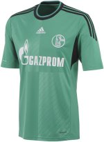
Two of the kits I like are definitely Valencia's home shirt, nice and simple but does the job, and Schalke's third kit.

valencia-13-14-joma-home-football-shirt-a.jpgSchalke 13-14 Third Kit (1).jpg


MF'84

A load of Bolanos
Jul 26, 2012
301
Derbyshire
I got mine today. The badge is the same as last season and the American Express on the front is woven in as last years. The only iron thing is the small Amex logo on the back. I can live with that and think it looks nice.

Probably an iron on back of kit logo in case we made it to the Premier League where such things aren't allowed, wouldn't have been time to get the shirts in stock with it woven in after the season finished... Possibly..!


pornomagboy

wake me up before you gogo who needs potter when
May 16, 2006
6,090
peacehaven


Superphil

Dismember
Jul 7, 2003
25,681
In a pile of football shirts
The away Rovers shirt is the same template that half the teams in the NWSL use.


Albion and Premier League latest from Sky Sports


Top
Link Here