SeagullSongs
And it's all gone quiet..
The green and black is my favourite albion kit, it's amazing and unique! Second favourite is this:


The green and black is my favourite albion kit, it's amazing and unique!


You mean this


And this
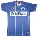
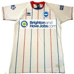
Brighton Chairman Tony Bloom has today announced his teams new kit alongside Manager Jason Mann. Despite starting the season in last years kit, Bloom has released details of the official 2012-2013 kit. Both kits feature Albion's traditional colours of blue and white. The home kit is mainly blue with white details whilst the away kit features white as the main colour with blue details.
This years kit maker is American giant Nike - a change from last years Errea. The main sponsor has also changed for the new season with Brighton and Hove Jobs losing their place on the shirt to make way for American Express - the clubs' stadium sponsor. Both Chairman and Manager hope that the new kits will inspire the club onto great things this year in the Premier League.
The green and black is my favourite albion kit, it's amazing and unique! Second favourite is this:


I agree, we should take a lead from this program, the fella is talking about current kits being boring, and a designer has come up with some more fashionable kits, scroll forward to about 25 seconds in!
Bundesliga Fashion.flv - YouTube
Groovy baby, especia;lly the bloke in the No.8 shirt!!!
You mean this


And this
Brighton Chairman Tony Bloom has today announced his teams new kit alongside Manager Jason Mann. Despite starting the season in last years kit, Bloom has released details of the official 2012-2013 kit. Both kits feature Albion's traditional colours of blue and white. The home kit is mainly blue with white details whilst the away kit features white as the main colour with blue details.
This years kit maker is American giant Nike - a change from last years Errea. The main sponsor has also changed for the new season with Brighton and Hove Jobs losing their place on the shirt to make way for American Express - the clubs' stadium sponsor. Both Chairman and Manager hope that the new kits will inspire the club onto great things this year in the Premier League.
personally think these look great regardless of any contracts we should go for this type of design - very nice imo
Errea make the French volley ball kits home and away are pretty much identical http://www.errea.co.uk would love the old pin stripes back!


No, no. no - proper blue and white stripes, not a blue version of Southampton's kit. At a distance these could be the kits of Leicester/Ipswich/Birmingham - any number of dull clubs.
Errea make the French volley ball kits home and away are pretty much identical http://www.errea.co.uk would love the old pin stripes back!
Agree with this one but one of my favourites was the 'Batman ' shirt.....This. I love our current away kit with block shorts but with green it looks dreadful. The red and black kit from 2 seasons ago was bang tidy...

My favourite too. Right up to the green and black which has replaced it.I was told that the blue/black design was in honour of Liam Brady's time at Inter but he didn't like the kit so it was only worn on a couple of occasions. Shame, I loved it.